Exploratory data analysis (EDA) is an important pillar of data science, a important step required to complete every project regardless of type of data you are working with. Exploratory analysis gives us a sense of what additional work should be performed to quantify and extract insights from our data.
In this post I have performed Exploratory Data analysis on Titanic Dataset.
Let’s start with importing required libraries.
%matplotlib inline
import numpy as np
import pandas as pd
import matplotlib.pyplot as plt
import seaborn as sns
Now I will read titanic dataset using Pandas read_csv method and explore first 5 rows of the data set.
titanic_df = pd.read_csv('titanic-data.csv')
titanic_df.head()
| PassengerId | Survived | Pclass | Name | Sex | Age | SibSp | Parch | Ticket | Fare | Cabin | Embarked | |
|---|---|---|---|---|---|---|---|---|---|---|---|---|
| 0 | 1 | 0 | 3 | Braund, Mr. Owen Harris | male | 22.0 | 1 | 0 | A/5 21171 | 7.2500 | NaN | S |
| 1 | 2 | 1 | 1 | Cumings, Mrs. John Bradley (Florence Briggs Th... | female | 38.0 | 1 | 0 | PC 17599 | 71.2833 | C85 | C |
| 2 | 3 | 1 | 3 | Heikkinen, Miss. Laina | female | 26.0 | 0 | 0 | STON/O2. 3101282 | 7.9250 | NaN | S |
| 3 | 4 | 1 | 1 | Futrelle, Mrs. Jacques Heath (Lily May Peel) | female | 35.0 | 1 | 0 | 113803 | 53.1000 | C123 | S |
| 4 | 5 | 0 | 3 | Allen, Mr. William Henry | male | 35.0 | 0 | 0 | 373450 | 8.0500 | NaN | S |
Data Description
(from https://www.kaggle.com/c/titanic)
- survival: Survival (0 = No; 1 = Yes)
- pclass: Passenger Class (1 = 1st; 2 = 2nd; 3 = 3rd)
- name: Name
- sex: Sex
- age: Age
- sibsp: Number of Siblings/Spouses Aboard
- parch: Number of Parents/Children Aboard
- ticket: Ticket Number
- fare: Passenger Fare
- cabin: Cabin
- embarked: Port of Embarkation (C = Cherbourg; Q = Queenstown; S = Southampton)
Variable Notes
pclass: A proxy for socio-economic status (SES) 1st = Upper 2nd = Middle 3rd = Lower
age: Age is fractional if less than 1. If the age is estimated, is it in the form of xx.5
sibsp: The dataset defines family relations in this way… Sibling = brother, sister, stepbrother, stepsister Spouse = husband, wife (mistresses and fiancés were ignored)
parch: The dataset defines family relations in this way… Parent = mother, father Child = daughter, son, stepdaughter, stepson Some children travelled only with a nanny, therefore parch=0 for them.
Now let’s see some statistical summary of the imported dataset using pandas.describe() method.
titanic_df.describe()
| PassengerId | Survived | Pclass | Age | SibSp | Parch | Fare | |
|---|---|---|---|---|---|---|---|
| count | 891.000000 | 891.000000 | 891.000000 | 714.000000 | 891.000000 | 891.000000 | 891.000000 |
| mean | 446.000000 | 0.383838 | 2.308642 | 29.699118 | 0.523008 | 0.381594 | 32.204208 |
| std | 257.353842 | 0.486592 | 0.836071 | 14.526497 | 1.102743 | 0.806057 | 49.693429 |
| min | 1.000000 | 0.000000 | 1.000000 | 0.420000 | 0.000000 | 0.000000 | 0.000000 |
| 25% | 223.500000 | 0.000000 | 2.000000 | 20.125000 | 0.000000 | 0.000000 | 7.910400 |
| 50% | 446.000000 | 0.000000 | 3.000000 | 28.000000 | 0.000000 | 0.000000 | 14.454200 |
| 75% | 668.500000 | 1.000000 | 3.000000 | 38.000000 | 1.000000 | 0.000000 | 31.000000 |
| max | 891.000000 | 1.000000 | 3.000000 | 80.000000 | 8.000000 | 6.000000 | 512.329200 |
The output DataFrame index depends on the requested dtypes:
For numeric dtypes, it will include: count, mean, std, min, max, and lower, 50, and upper percentiles.
From above table I see that mean of survived column is 0.38, but since this is not complete dataset we cannot conclude on that.
Count for ‘Age’ column is 714, it means dataset has some missing values. I will have to cleanup the data before I start exploring.
Data cleanup
Now let’s get some info on datatypes in the dataset using pandas.info() method. It will give us concise summary of a DataFrame.
titanic_df.info()
<class 'pandas.core.frame.DataFrame'>
RangeIndex: 891 entries, 0 to 890
Data columns (total 12 columns):
PassengerId    891 non-null int64
Survived       891 non-null int64
Pclass         891 non-null int64
Name           891 non-null object
Sex            891 non-null object
Age            714 non-null float64
SibSp          891 non-null int64
Parch          891 non-null int64
Ticket         891 non-null object
Fare           891 non-null float64
Cabin          204 non-null object
Embarked       889 non-null object
dtypes: float64(2), int64(5), object(5)
memory usage: 83.6+ KB
I see that there are some missing values in ‘Age’, ‘Cabin’ and ‘Embarked’ columns. I’ll not use ‘Cabin’ which is the most missing and will ignore it. There are some columns which are not required in my analysis so I will drop them. For the missing ‘Ages’ and ‘Embarked’ I will omit those rows when I use the data.
titanic_cleaned = titanic_df.drop(['PassengerId', 'Name', 'Ticket', 'Cabin'], axis=1)
titanic_cleaned.head()
| Survived | Pclass | Sex | Age | SibSp | Parch | Fare | Embarked | |
|---|---|---|---|---|---|---|---|---|
| 0 | 0 | 3 | male | 22.0 | 1 | 0 | 7.2500 | S |
| 1 | 1 | 1 | female | 38.0 | 1 | 0 | 71.2833 | C |
| 2 | 1 | 3 | female | 26.0 | 0 | 0 | 7.9250 | S |
| 3 | 1 | 1 | female | 35.0 | 1 | 0 | 53.1000 | S |
| 4 | 0 | 3 | male | 35.0 | 0 | 0 | 8.0500 | S |
titanic_cleaned.describe()
| Survived | Pclass | Age | SibSp | Parch | Fare | |
|---|---|---|---|---|---|---|
| count | 891.000000 | 891.000000 | 714.000000 | 891.000000 | 891.000000 | 891.000000 |
| mean | 0.383838 | 2.308642 | 29.699118 | 0.523008 | 0.381594 | 32.204208 |
| std | 0.486592 | 0.836071 | 14.526497 | 1.102743 | 0.806057 | 49.693429 |
| min | 0.000000 | 1.000000 | 0.420000 | 0.000000 | 0.000000 | 0.000000 |
| 25% | 0.000000 | 2.000000 | 20.125000 | 0.000000 | 0.000000 | 7.910400 |
| 50% | 0.000000 | 3.000000 | 28.000000 | 0.000000 | 0.000000 | 14.454200 |
| 75% | 1.000000 | 3.000000 | 38.000000 | 1.000000 | 0.000000 | 31.000000 |
| max | 1.000000 | 3.000000 | 80.000000 | 8.000000 | 6.000000 | 512.329200 |
titanic_cleaned.isnull().sum()
Survived      0
Pclass        0
Sex           0
Age         177
SibSp         0
Parch         0
Fare          0
Embarked      2
dtype: int64
Data exploration:
As part this project I want to explore answers to following questions.
- How Survival is correlated to other attributes of the dataset ? Findout Pearson’s r.
- Did Sex play a role in Survival ?
- Did class played role in survival ?
- How fare is related to Age, Class and Port of Embarkation ?
- How Embarkation varied across different ports ?
Lets start with Q1.
Q1. How Survival is correlated to other attributes of the dataset ? Findout Pearson’s r.
I will compute pairwise correlation of columns(excluding NA/null values) using pandas.DataFrame.corr method. I will use ‘pearson’ standard correlation coefficient for the calculation.
titanic_cleaned.corr(method='pearson')
| Survived | Pclass | Age | SibSp | Parch | Fare | |
|---|---|---|---|---|---|---|
| Survived | 1.000000 | -0.338481 | -0.077221 | -0.035322 | 0.081629 | 0.257307 |
| Pclass | -0.338481 | 1.000000 | -0.369226 | 0.083081 | 0.018443 | -0.549500 |
| Age | -0.077221 | -0.369226 | 1.000000 | -0.308247 | -0.189119 | 0.096067 |
| SibSp | -0.035322 | 0.083081 | -0.308247 | 1.000000 | 0.414838 | 0.159651 |
| Parch | 0.081629 | 0.018443 | -0.189119 | 0.414838 | 1.000000 | 0.216225 |
| Fare | 0.257307 | -0.549500 | 0.096067 | 0.159651 | 0.216225 | 1.000000 |
From above correlation table we can see that Survival is inversly correlated to Pclass value. In our case since Class 1 has lower numerical value, it had better survival rate compared to other classes.
We also see that Age and Survival are slighltly correlated.
We will try to visualize these corelation below.
This brings us to Q2
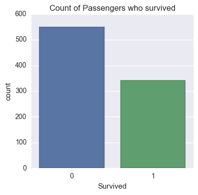
Q2. Did Sex play a role in Survival ?
Lets pull a histogram of ‘Survived’ column.
#titanic_cleaned.groupby(['Survived']).hist()

sns.factorplot('Survived', data=titanic_df, kind='count')
sns.plt.title('Count of Passengers who survived')
Let’s see agewise distribution of the passenger aboard the Titanic.
#Histogram of Age of the given data set(sample)
#plt.hist(titanic_cleaned['Age'].dropna())
sns.distplot(titanic_cleaned['Age'].dropna(), bins=15, kde=False)
sns.plt.ylabel('Count')
sns.plt.title('Agewise distribution of the passenger aboard the Titanic')
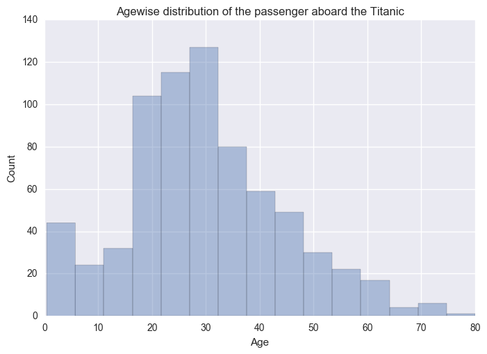
Many passensgers are of age 15-40 yrs. But again this is not complete dataset.
Now I would like to see agewise distribution of passsengers for both Genders. I will do this by plotting the rows where ‘Sex’ is Male and Female respectively.
#Age wise Distribution of Male and Female passengers
sns.plt.hist(titanic_cleaned['Age'][(titanic_cleaned['Sex'] == 'female')].dropna(), bins=7, label='Female', histtype='stepfilled')
sns.plt.hist(titanic_cleaned['Age'][(titanic_cleaned['Sex'] == 'male')].dropna(), bins=7, label='Male', alpha=.7, histtype='stepfilled')
sns.plt.xlabel('Age')
sns.plt.ylabel('Count')
sns.plt.title('Age wise Distribution of Male and Female passengers')
sns.plt.legend()
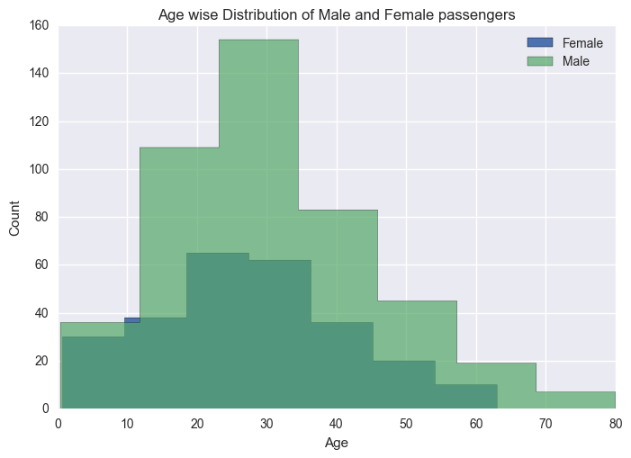
There were many male passengers aboared compared to female passengers.
I will do a agewise distribution plot for passenges who Survived across both Genders by filtering out rows where ‘Survived’ = 1.
#Age wise Distribution of Male and Female survivors
sns.plt.hist(titanic_cleaned['Age'][(titanic_cleaned['Sex'] == 'female') & (titanic_cleaned['Survived'] == 1)].dropna(), bins=7, label='Female', histtype='stepfilled')
sns.plt.hist(titanic_cleaned['Age'][(titanic_cleaned['Sex'] == 'male') & (titanic_cleaned['Survived'] == 1)].dropna(), bins=7, label='Male', alpha=.7, histtype='stepfilled')
sns.plt.xlabel('Age')
sns.plt.ylabel('Count')
sns.plt.title('Age wise Distribution of Male and Female survivors')
sns.plt.legend()
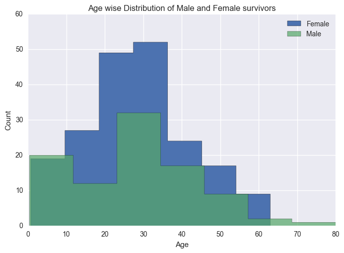
From above visualization, it is evident that Women had better survival chance. One can do an Hypothesis test to verify this.
Lets take a look for youngest and oldest passenger to survive.
yougest_survive = titanic_cleaned['Age'][(titanic_cleaned['Survived'] == 1)].min()
youngest_die = titanic_cleaned['Age'][(titanic_cleaned['Survived'] == 0)].min()
oldest_survive = titanic_cleaned['Age'][(titanic_cleaned['Survived'] == 1)].max()
oldest_die = titanic_cleaned['Age'][(titanic_cleaned['Survived'] == 0)].max()

print "Yougest to survive: {} \nYoungest to die: {} \nOldest to survive: {} \nOldest to die: {}".format(yougest_survive, youngest_die, oldest_survive, oldest_die)
Yougest to survive: 0.42
Youngest to die: 1.0
Oldest to survive: 80.0
Oldest to die: 74.0
Q3. Did class played role in survival ?
Next, let’s look at survival based on passenger’s class for both genders.
We can do this by grouping the dataframe with respect to Pclass, Survived and Sex.
#sns.plt.hist(titanic_cleaned.groupby(['Pclass', 'Survived', 'Sex']).size())
grouped_by_pclass = titanic_cleaned.groupby(['Pclass', 'Survived', 'Sex'])
grouped_by_pclass.size()
Pclass  Survived  Sex
1       0         female      3
                  male       77
        1         female     91
                  male       45
2       0         female      6
                  male       91
        1         female     70
                  male       17
3       0         female     72
                  male      300
        1         female     72
                  male       47
dtype: int64
titanic_cleaned.groupby(['Pclass', 'Sex']).describe()
| Age | Fare | Parch | SibSp | Survived | |||
|---|---|---|---|---|---|---|---|
| Pclass | Sex | ||||||
| 1 | female | count | 85.000000 | 94.000000 | 94.000000 | 94.000000 | 94.000000 |
| mean | 34.611765 | 106.125798 | 0.457447 | 0.553191 | 0.968085 | ||
| std | 13.612052 | 74.259988 | 0.728305 | 0.665865 | 0.176716 | ||
| min | 2.000000 | 25.929200 | 0.000000 | 0.000000 | 0.000000 | ||
| 25% | 23.000000 | 57.244800 | 0.000000 | 0.000000 | 1.000000 | ||
| 50% | 35.000000 | 82.664550 | 0.000000 | 0.000000 | 1.000000 | ||
| 75% | 44.000000 | 134.500000 | 1.000000 | 1.000000 | 1.000000 | ||
| max | 63.000000 | 512.329200 | 2.000000 | 3.000000 | 1.000000 | ||
| male | count | 101.000000 | 122.000000 | 122.000000 | 122.000000 | 122.000000 | |
| mean | 41.281386 | 67.226127 | 0.278689 | 0.311475 | 0.368852 | ||
| std | 15.139570 | 77.548021 | 0.658853 | 0.546695 | 0.484484 | ||
| min | 0.920000 | 0.000000 | 0.000000 | 0.000000 | 0.000000 | ||
| 25% | 30.000000 | 27.728100 | 0.000000 | 0.000000 | 0.000000 | ||
| 50% | 40.000000 | 41.262500 | 0.000000 | 0.000000 | 0.000000 | ||
| 75% | 51.000000 | 78.459375 | 0.000000 | 1.000000 | 1.000000 | ||
| max | 80.000000 | 512.329200 | 4.000000 | 3.000000 | 1.000000 | ||
| 2 | female | count | 74.000000 | 76.000000 | 76.000000 | 76.000000 | 76.000000 |
| mean | 28.722973 | 21.970121 | 0.605263 | 0.486842 | 0.921053 | ||
| std | 12.872702 | 10.891796 | 0.833930 | 0.642774 | 0.271448 | ||
| min | 2.000000 | 10.500000 | 0.000000 | 0.000000 | 0.000000 | ||
| 25% | 22.250000 | 13.000000 | 0.000000 | 0.000000 | 1.000000 | ||
| 50% | 28.000000 | 22.000000 | 0.000000 | 0.000000 | 1.000000 | ||
| 75% | 36.000000 | 26.062500 | 1.000000 | 1.000000 | 1.000000 | ||
| max | 57.000000 | 65.000000 | 3.000000 | 3.000000 | 1.000000 | ||
| male | count | 99.000000 | 108.000000 | 108.000000 | 108.000000 | 108.000000 | |
| mean | 30.740707 | 19.741782 | 0.222222 | 0.342593 | 0.157407 | ||
| std | 14.793894 | 14.922235 | 0.517603 | 0.566380 | 0.365882 | ||
| min | 0.670000 | 0.000000 | 0.000000 | 0.000000 | 0.000000 | ||
| 25% | 23.000000 | 12.331250 | 0.000000 | 0.000000 | 0.000000 | ||
| 50% | 30.000000 | 13.000000 | 0.000000 | 0.000000 | 0.000000 | ||
| 75% | 36.750000 | 26.000000 | 0.000000 | 1.000000 | 0.000000 | ||
| max | 70.000000 | 73.500000 | 2.000000 | 2.000000 | 1.000000 | ||
| 3 | female | count | 102.000000 | 144.000000 | 144.000000 | 144.000000 | 144.000000 |
| mean | 21.750000 | 16.118810 | 0.798611 | 0.895833 | 0.500000 | ||
| std | 12.729964 | 11.690314 | 1.237976 | 1.531573 | 0.501745 | ||
| min | 0.750000 | 6.750000 | 0.000000 | 0.000000 | 0.000000 | ||
| 25% | 14.125000 | 7.854200 | 0.000000 | 0.000000 | 0.000000 | ||
| 50% | 21.500000 | 12.475000 | 0.000000 | 0.000000 | 0.500000 | ||
| 75% | 29.750000 | 20.221875 | 1.000000 | 1.000000 | 1.000000 | ||
| max | 63.000000 | 69.550000 | 6.000000 | 8.000000 | 1.000000 | ||
| male | count | 253.000000 | 347.000000 | 347.000000 | 347.000000 | 347.000000 | |
| mean | 26.507589 | 12.661633 | 0.224784 | 0.498559 | 0.135447 | ||
| std | 12.159514 | 11.681696 | 0.623404 | 1.288846 | 0.342694 | ||
| min | 0.420000 | 0.000000 | 0.000000 | 0.000000 | 0.000000 | ||
| 25% | 20.000000 | 7.750000 | 0.000000 | 0.000000 | 0.000000 | ||
| 50% | 25.000000 | 7.925000 | 0.000000 | 0.000000 | 0.000000 | ||
| 75% | 33.000000 | 10.008300 | 0.000000 | 0.000000 | 0.000000 | ||
| max | 74.000000 | 69.550000 | 5.000000 | 8.000000 | 1.000000 |
I would also like to see the survival rate across all the class. I can do this by taking sum of survived passengers for each class and divide it by totla number of passenger for that class and multiplying by 100. I will use pandas groupby function to segregate passengers according to their class.
titanic_cleaned.groupby(['Pclass'])['Survived'].sum()/titanic_cleaned.groupby(['Pclass'])['Survived'].count()*100
Pclass
1    62.962963
2    47.282609
3    24.236253
Name: Survived, dtype: float64
I see Class did play role in survival of the passengers. Now let’s visualize the same.
sns.factorplot('Survived', col='Pclass', data=titanic_cleaned, kind='count', size=7, aspect=.8)
plt.subplots_adjust(top=0.9)
sns.plt.suptitle('Class wise segregation of passengers', fontsize=16)
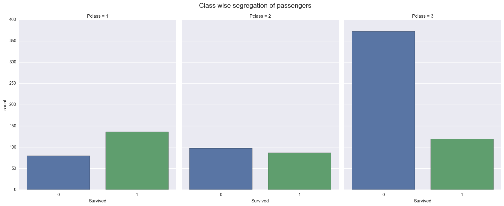
Above visualization compares passengers who survived the tragedy and who did not, across three classes. We can also drill down further to visualize survival of passengers of both genders across 3 classes.
sns.factorplot('Survived', col='Pclass', hue='Sex', data=titanic_cleaned, kind='count', size=7, aspect=.8)
plt.subplots_adjust(top=0.9)
sns.plt.suptitle('Class and gender wise segregation of passengers', fontsize=16)
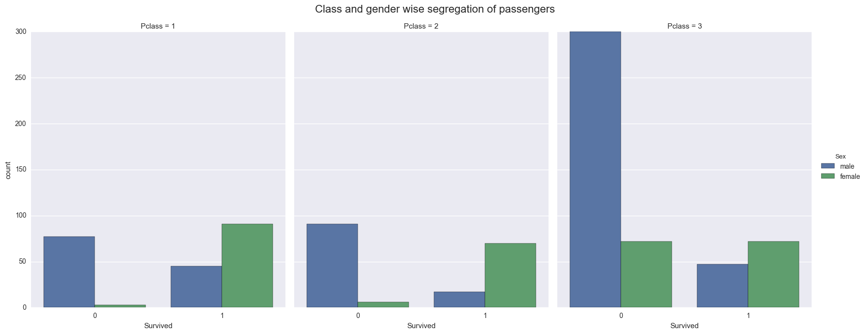
From above visualization we can see that class played important for Survival of Male and Female passengers. This brings us to my next questions.
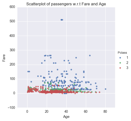
Q4. How fare is related to Age, Class and Port of Embarkation ?
Q5. How Embarkation varied across different ports ?
Let’s see how Fare varies with respect to Age and Port of Embarkation. I will do a scatterplot of passengers from 3 classes for Age and Fare on X and Y axis.
sns.lmplot('Age', 'Fare', data=titanic_cleaned, fit_reg=False, hue="Pclass", scatter_kws={"marker": ".", "s": 20})
sns.plt.title('Scatterplot of passengers w.r.t Fare and Age')
I can segregate the passengers according to thier Port of Embarkation and then compare Fare v/s Age across 3 classes.
sns.lmplot('Age', 'Fare', data=titanic_cleaned, fit_reg=False, hue="Pclass", col="Embarked", scatter_kws={"marker": ".", "s": 20})
plt.subplots_adjust(top=0.9)
sns.plt.suptitle('Scatterplot of passengers w.r.t Fare and Age for diff. ports', fontsize=16)
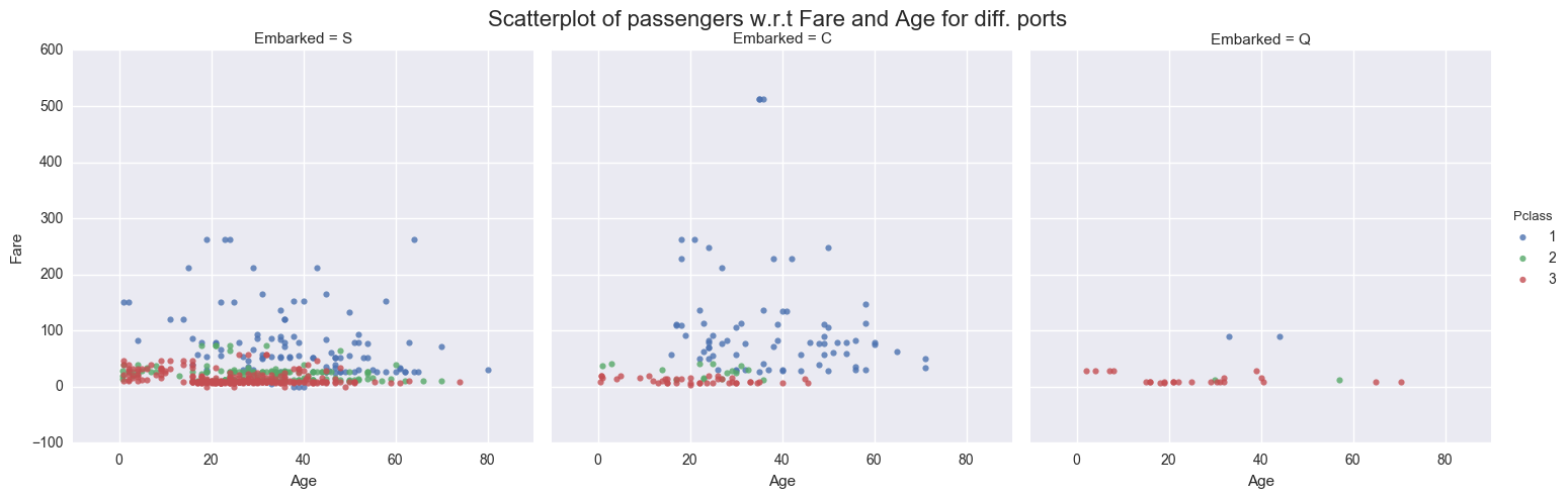
From above visualization we can see that Fare is quite uniform for Class 2 and 3 across all ages. Fare varies for Class 1 across all ages, but we cannot conclude why it varies. We need more attributes to our data points to drill down to the reason for variation. We can also observe that lot of passengers embarked from port of Southampton.
Conclusions
From my exploratory analysis of Titanic dataset we conclude that, women had higher chances of survival. We can do a t test to come up with chances(probability) of survival. I also see that Class(Socio-Economic status) of the passengers had played a role in their survival. I also compared fare across different classes and found that it varied a lot for Class 1 passenger, although I could not conclude as to why it varried diffrently for Class 1 due to insufficient data.
There were some limitation for this dataset such as missing values for some attributes of passesngers. This is not in any form a exhaustive study. More can be done on this data set.
Reference:
Websites:
Books: Python Data Science Handbook, By - Jake VanderPlas